By Tami Klein
Posted in design
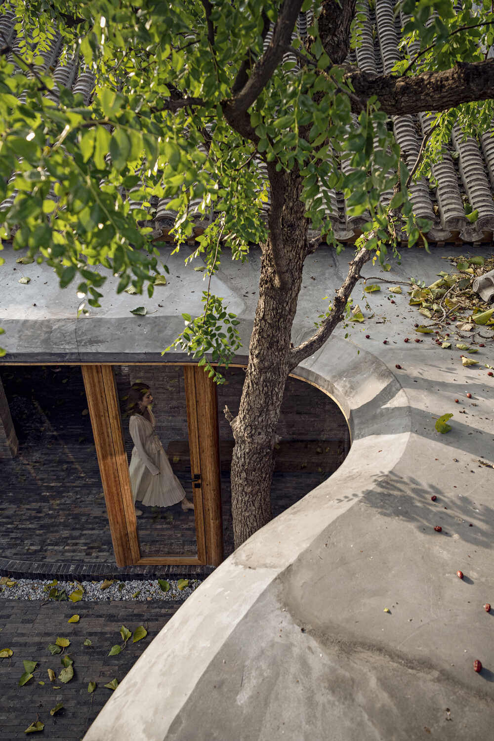
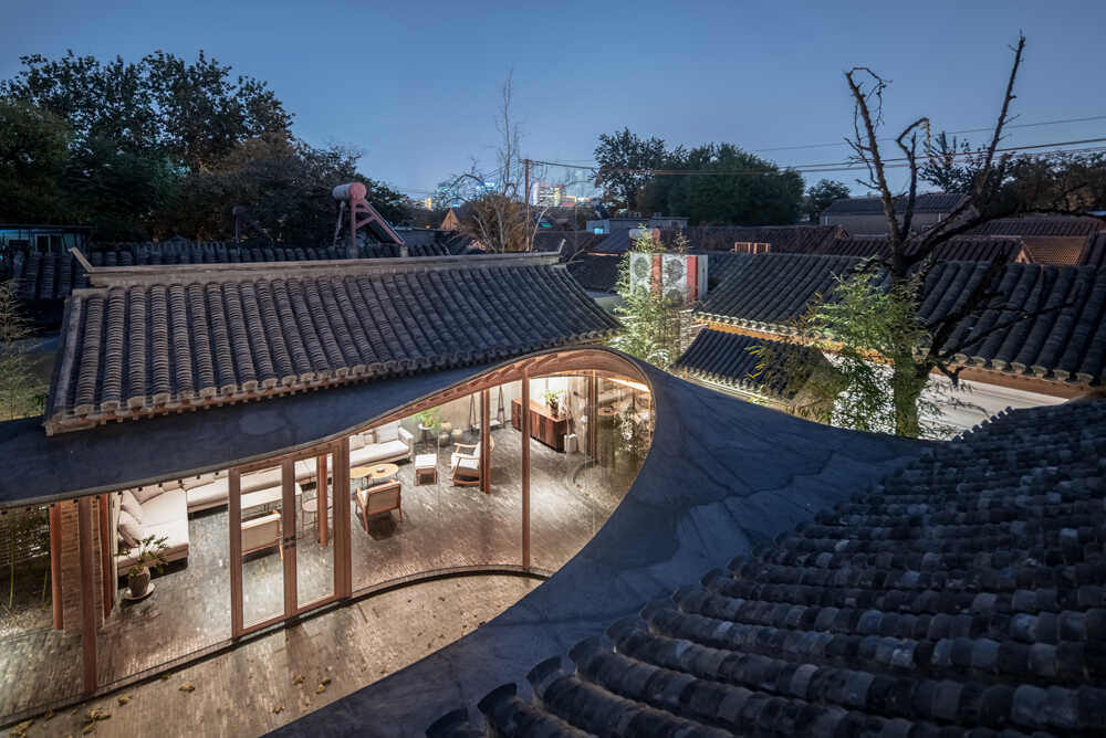
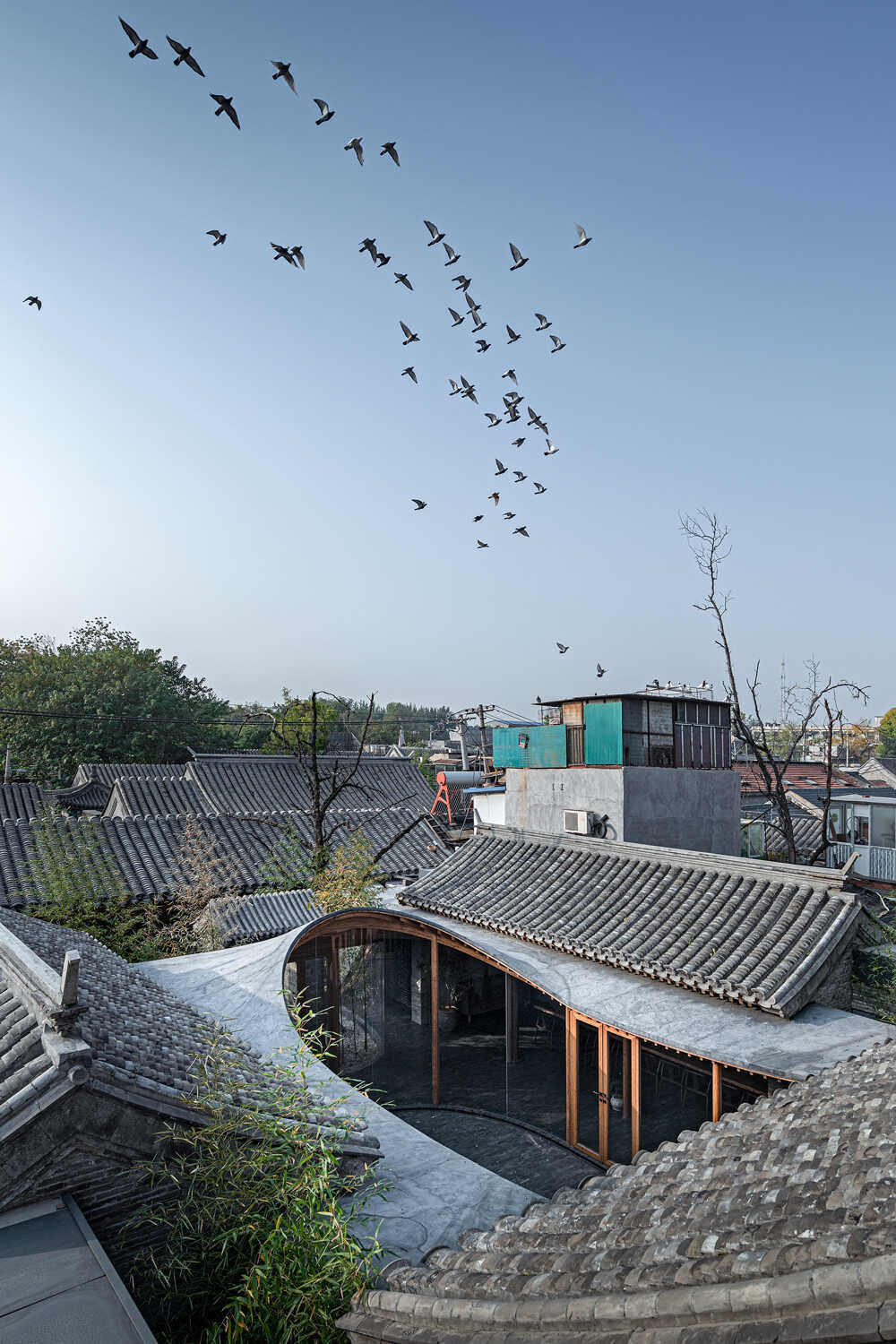
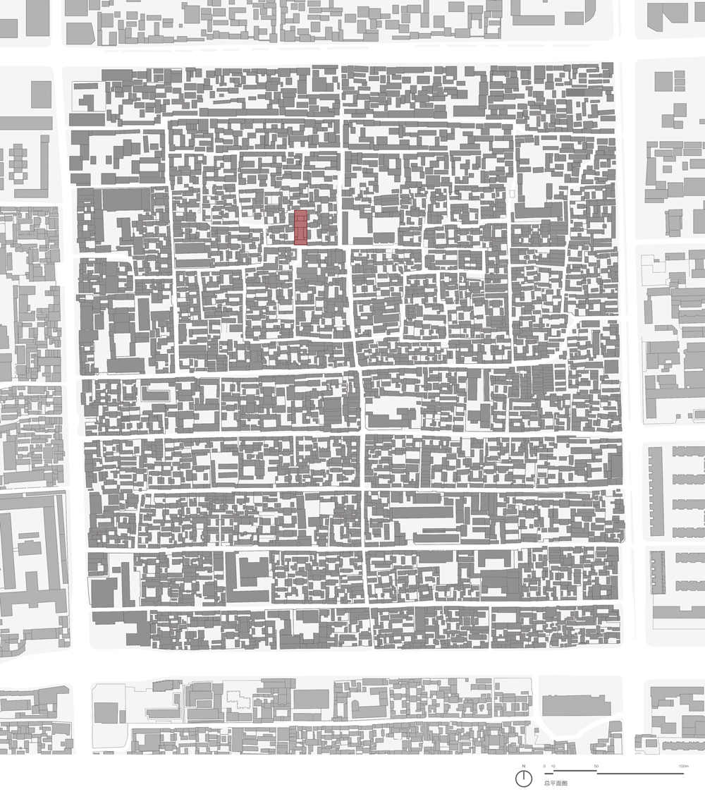
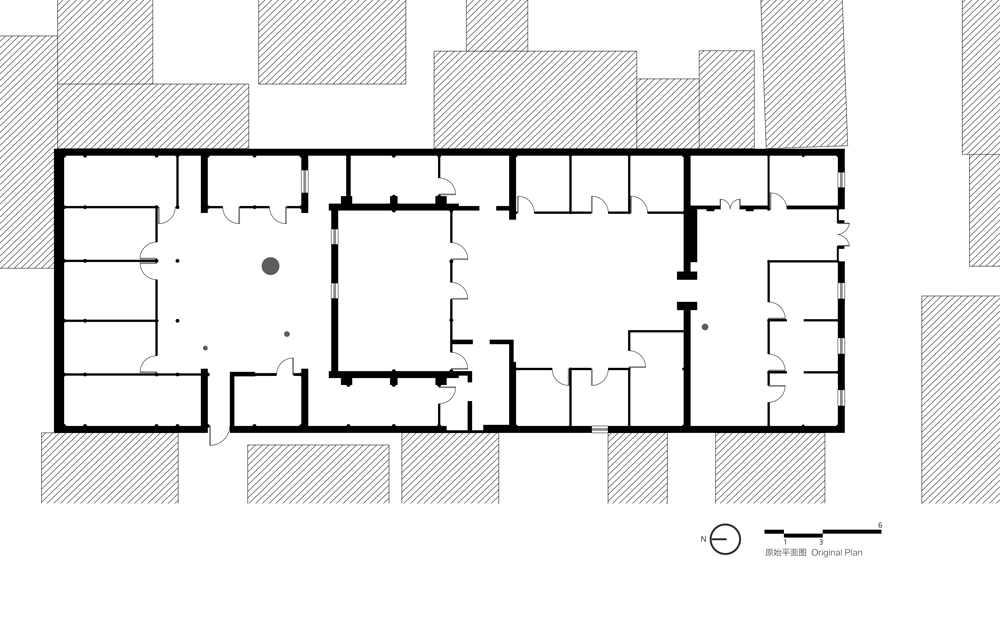
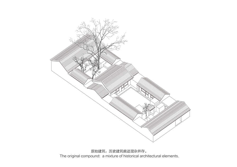
Qishe Courtyard is a surprising architectural project, melding old and new, taking shape in an ancient quarter of the Chinese capital. Located in a traditional Chinese residential complex, known as a “Siheyuan,” the project consists of three internal courtyards that, together, are 42 meters long and 15 meters wide. The name “Qishe” is derived from the Chinese words “Qi” meaning “seven” and “She” meaning “house,” because it is compound number seven on its street, and has seven roofs. Prior to the restoration, the Siheyuan was a collection of old, dilapidated buildings.
In recent years, China has realized that it was mistaken to demolish ancient, traditional residences and build modern neighborhoods in their place. Observers of architecture in China, especially in the older neighborhoods of large cities, can see that the designers are finding ways to incorporate older elements in very creative, even breathtaking, architecture.
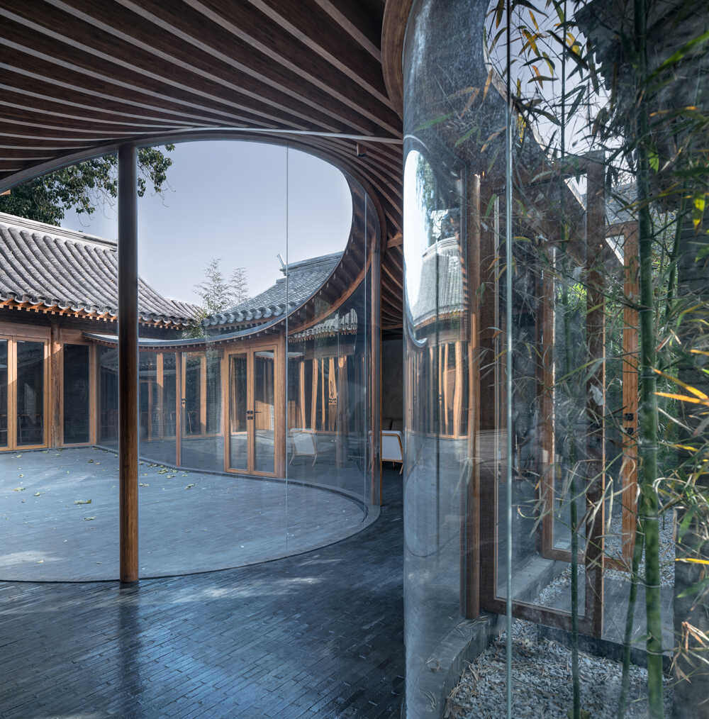
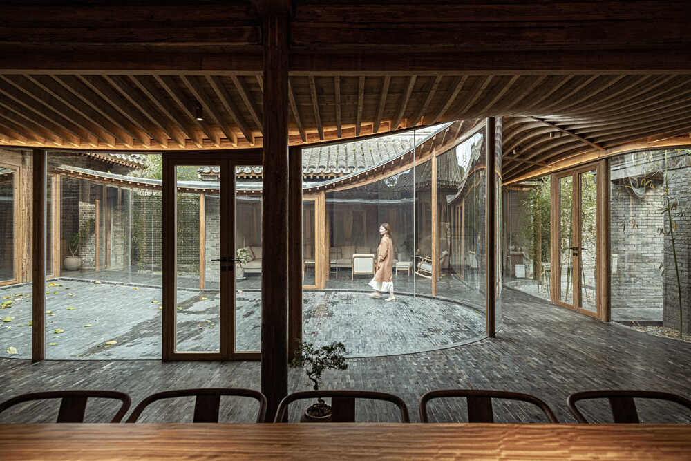
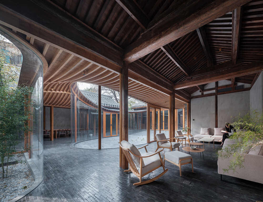
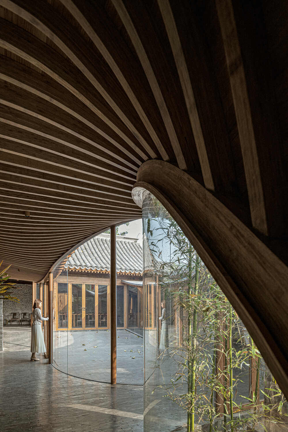
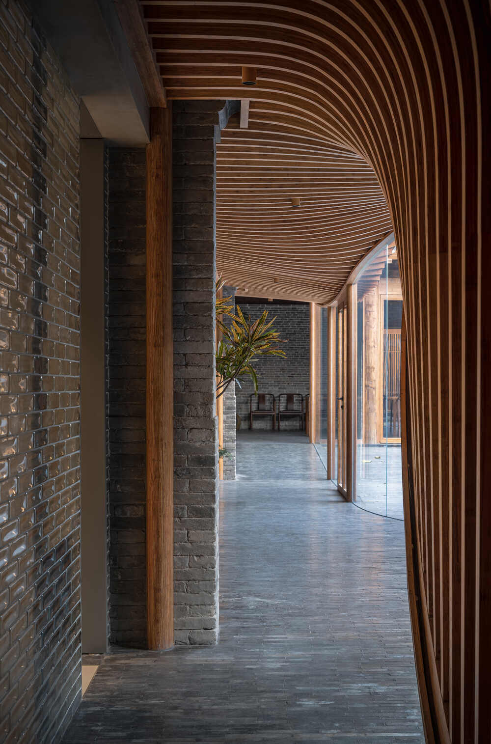
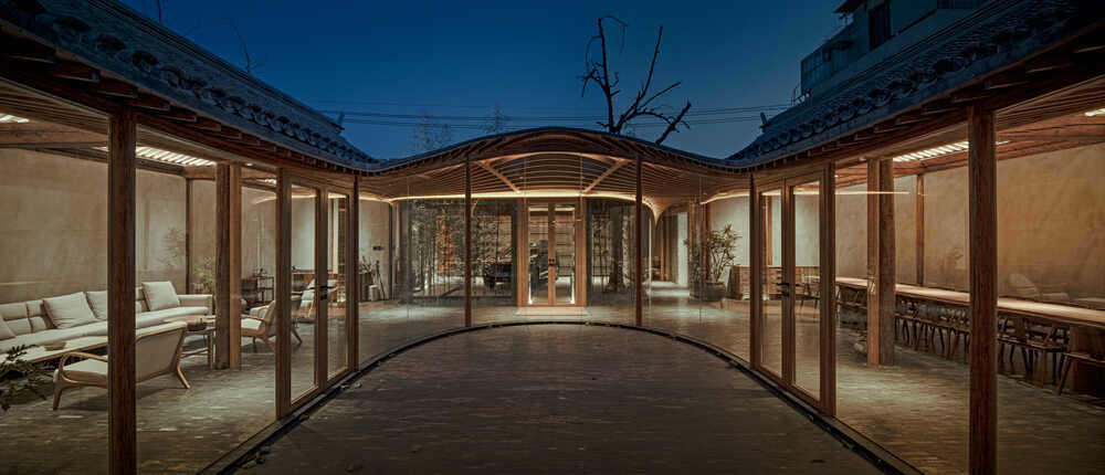
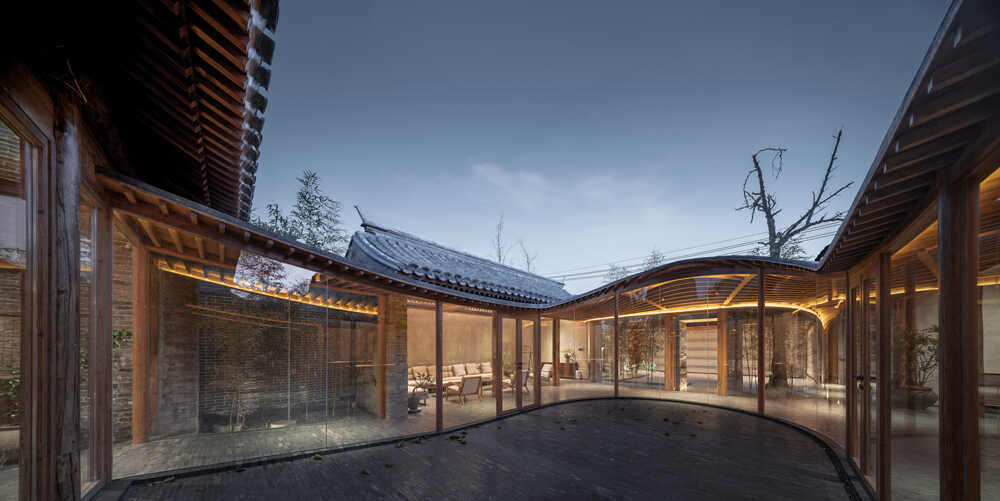
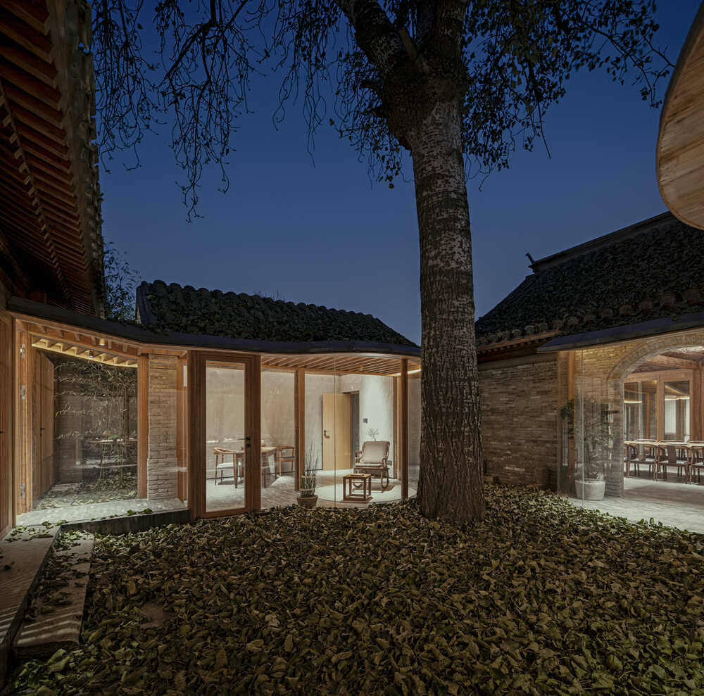
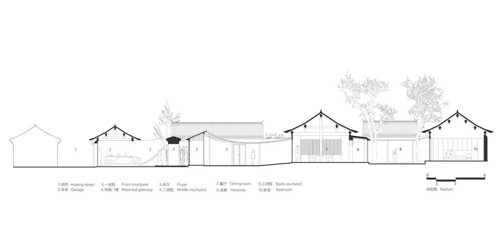
Archstudio, among most prominent architectural firms in Beijing, set a double goal for itself when undertaking the project described in this article: * to preserve the old while building a very modern home. The result is an architectural twist. The studio has dubbed the element that facilitates linking old to new, “veranda spaces.” With great subtlety, the veranda spaces unify the seven roofs in an undulating pattern that emphasizes an aspect that is especially important in the East – unceasing flow. The look is magical, almost resembling a fairy tale. Why do I mention this? Because the West is so different, with its straight lines and very different decorative elements.
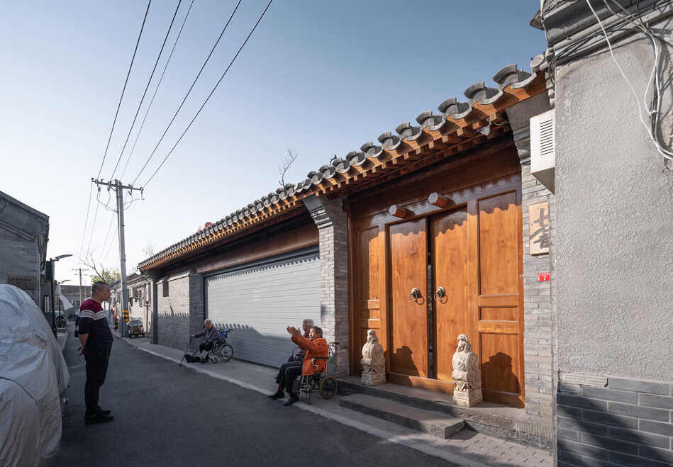
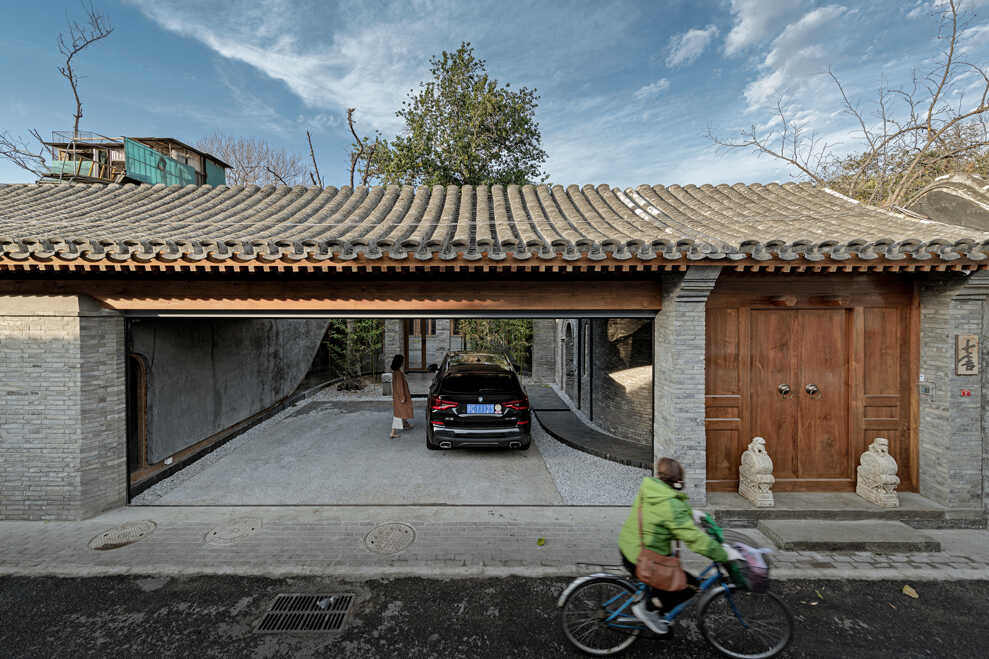
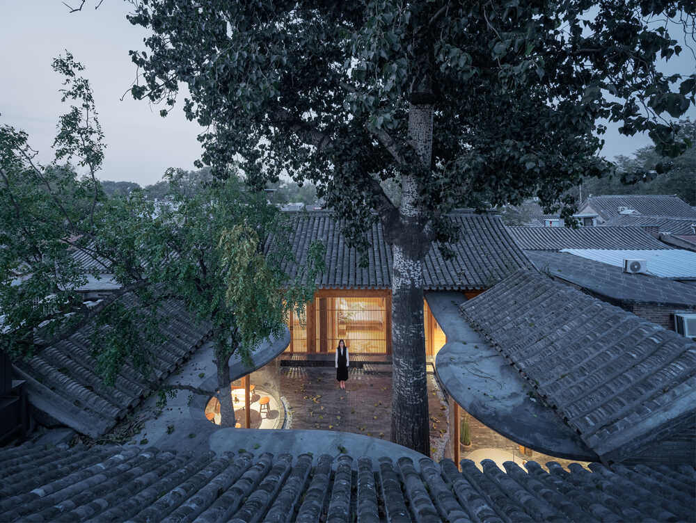
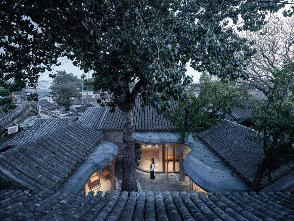
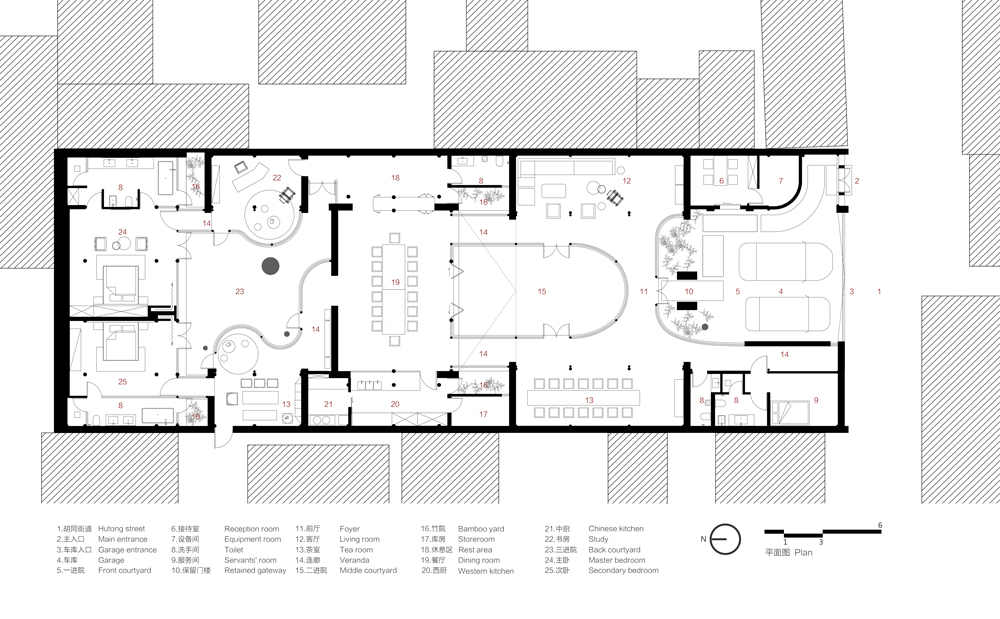
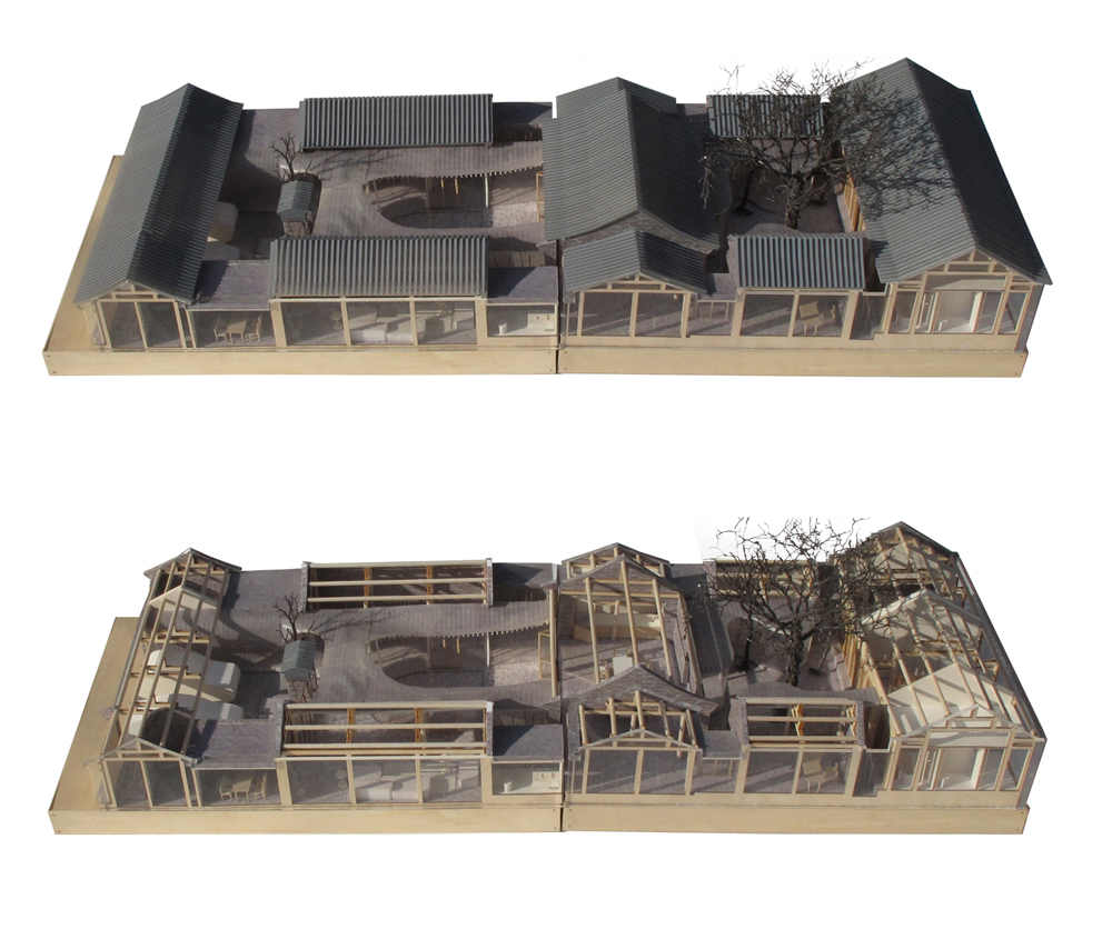
The front yard is meant for parking, serving as the “garage” to use American terminology. Since the entrance to the house is from the street/alley, the front door to the house is off center, adjacent to the parking area. Note that the doorway is arched and that traditional elements adorn the front entrance. Loyalty to the past is expressed in the preservation of a tree that remains standing, despite having dried out over the years. The back wall of the front yard was demolished to build the transparent veranda. The wall of the front yard curves downward to make space for several modern functions: a laundry room, a utility room and a storeroom.
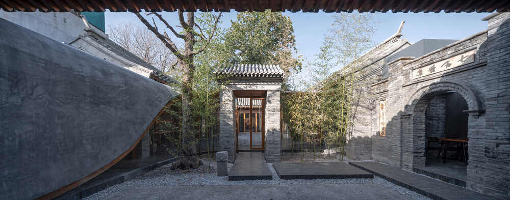
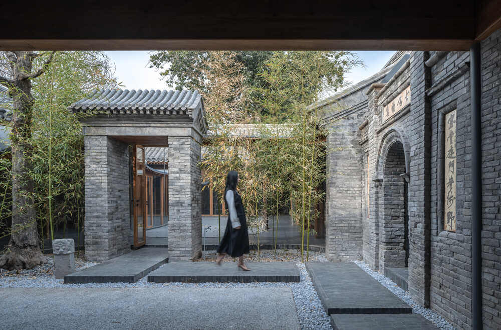
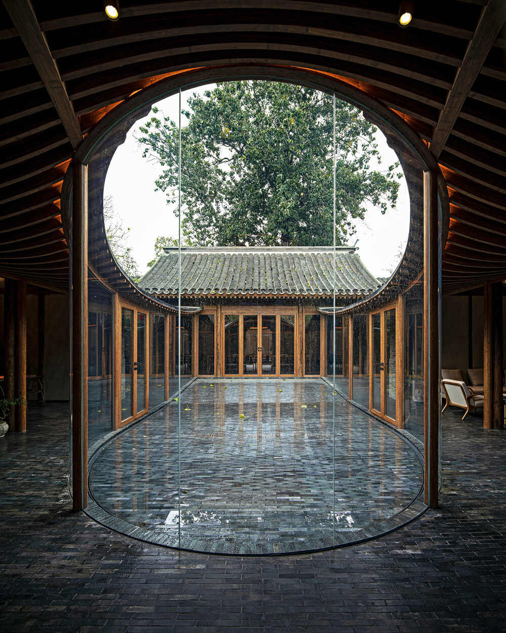
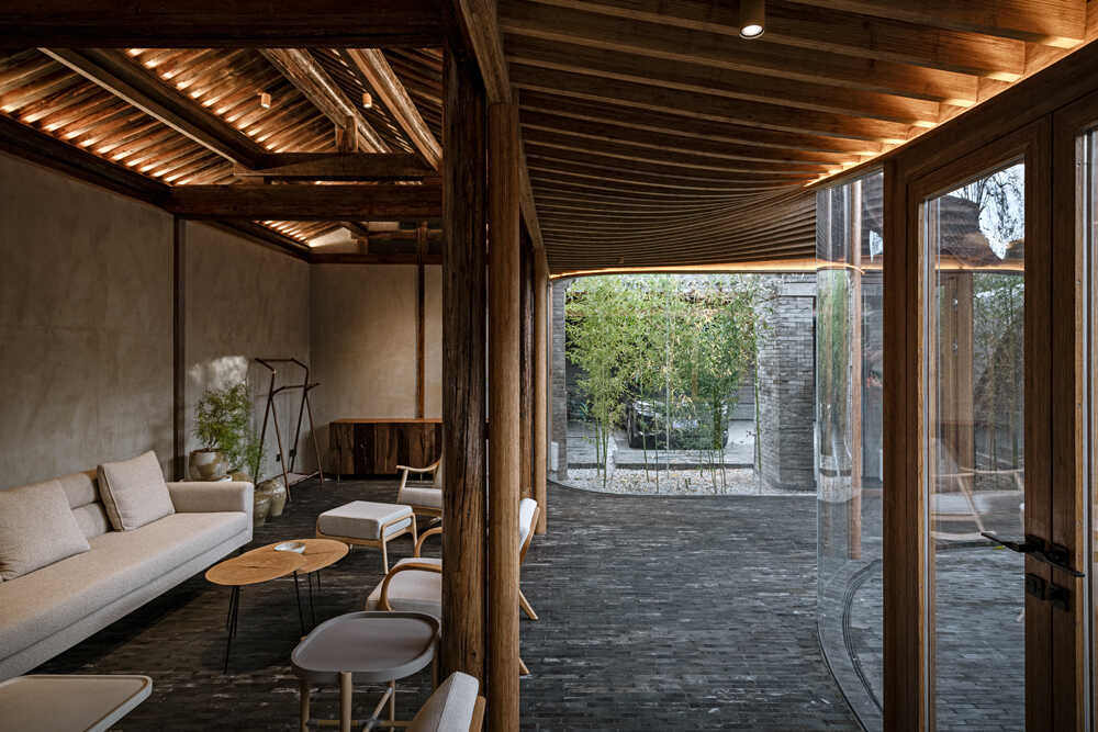
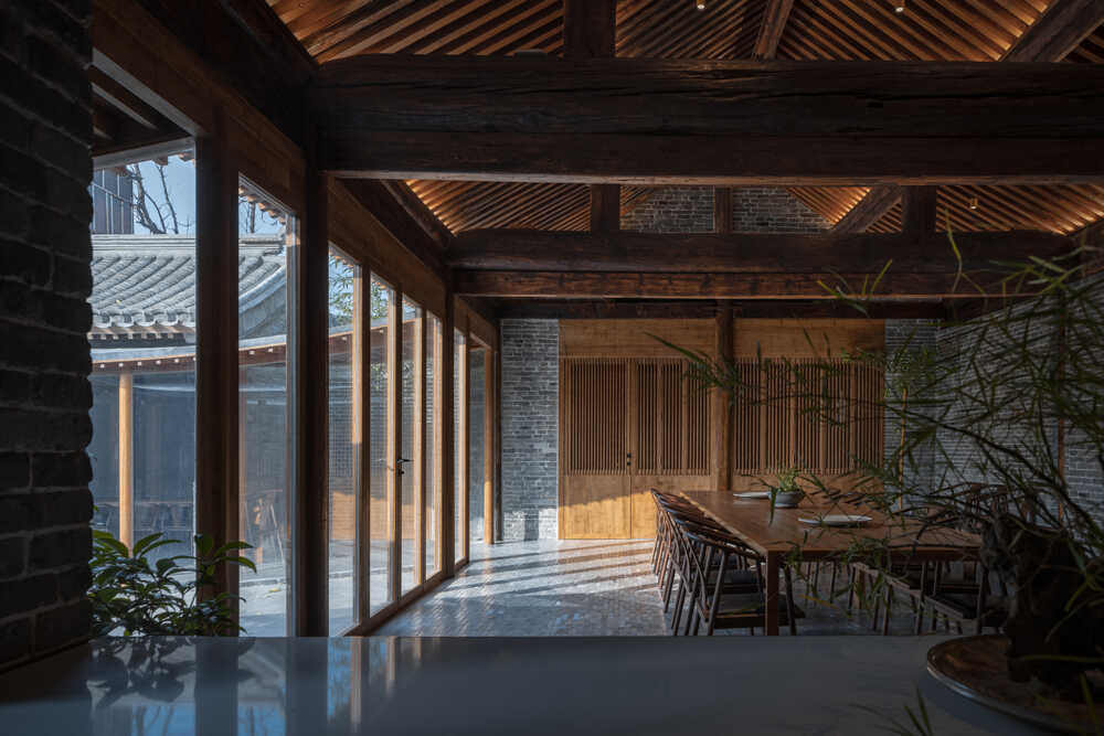
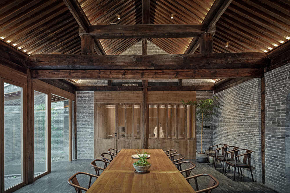
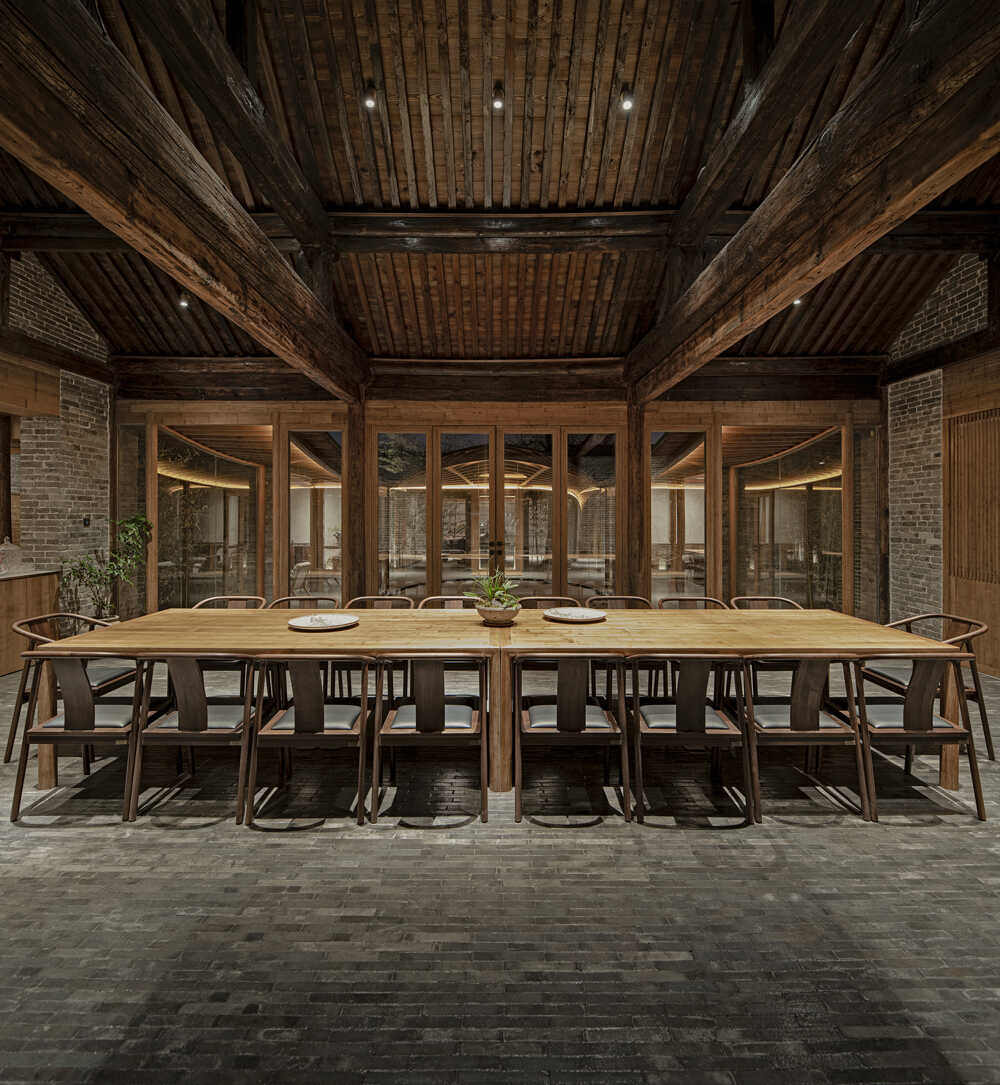
The central courtyard was designed to accommodate the activities of all members of the household. In the past, this courtyard was surrounded by three houses, one to the north and another on each side of the northern house. Based on an old diagram, the living room, tea room, dining room and kitchen were designed in place of the three houses. The planners maintained the previous symmetry of the spatial format, which provides a certain air of formality, which is also characteristic of the ancient tradition. The “upper slopes” that join the seven roofs to the transparent veranda, improve the connectivity between the interior spaces. The dining room opens onto the courtyard through a folding door. In the center of the dining room wall there is a newly restored, vaulted door restored.
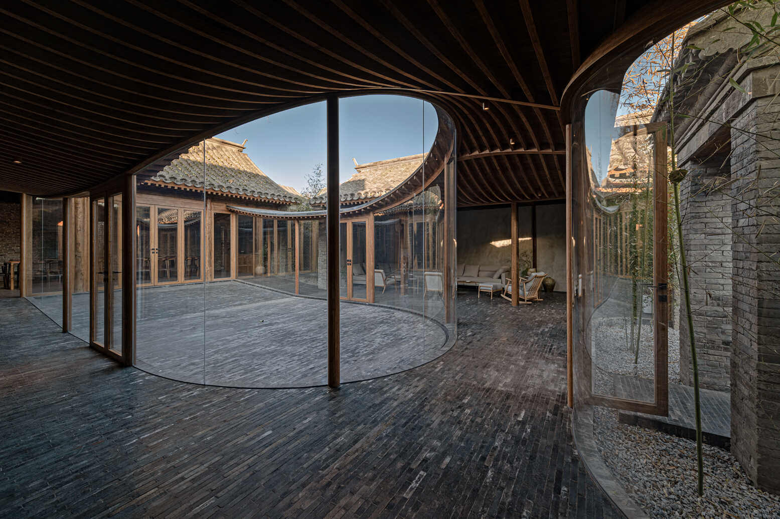
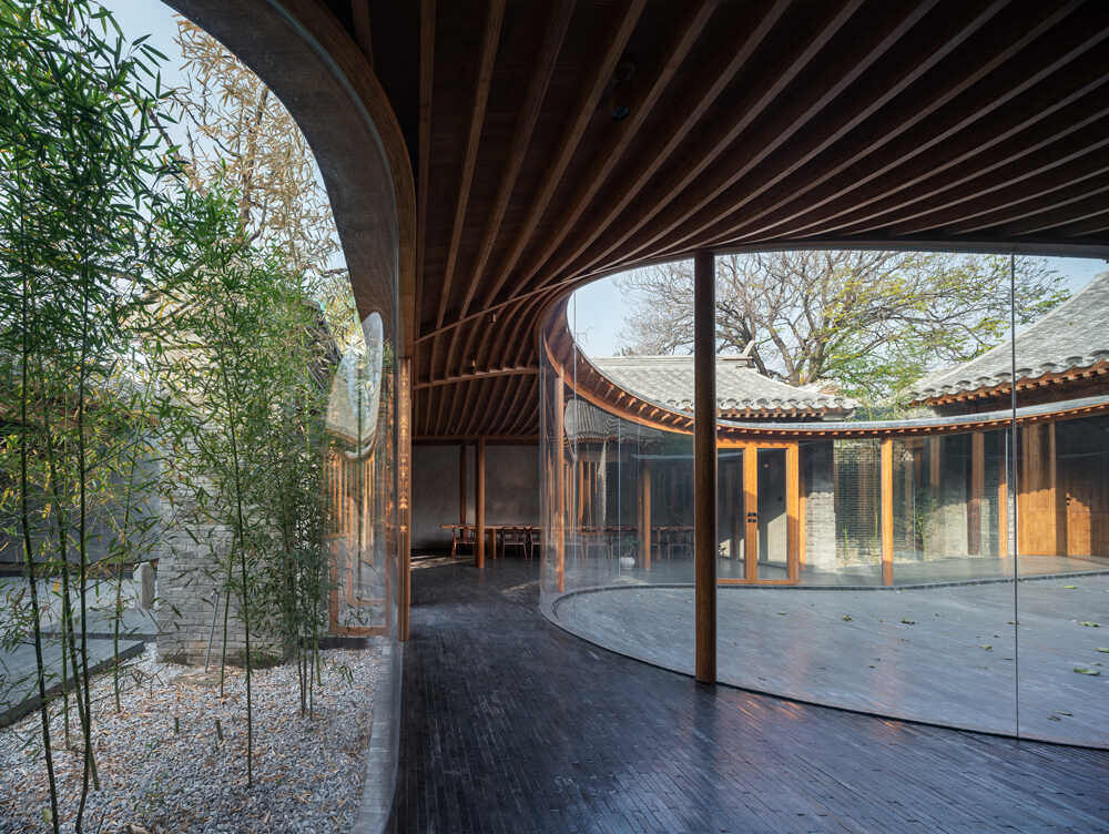
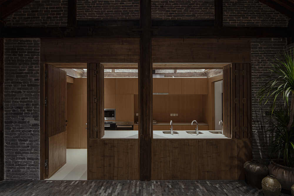
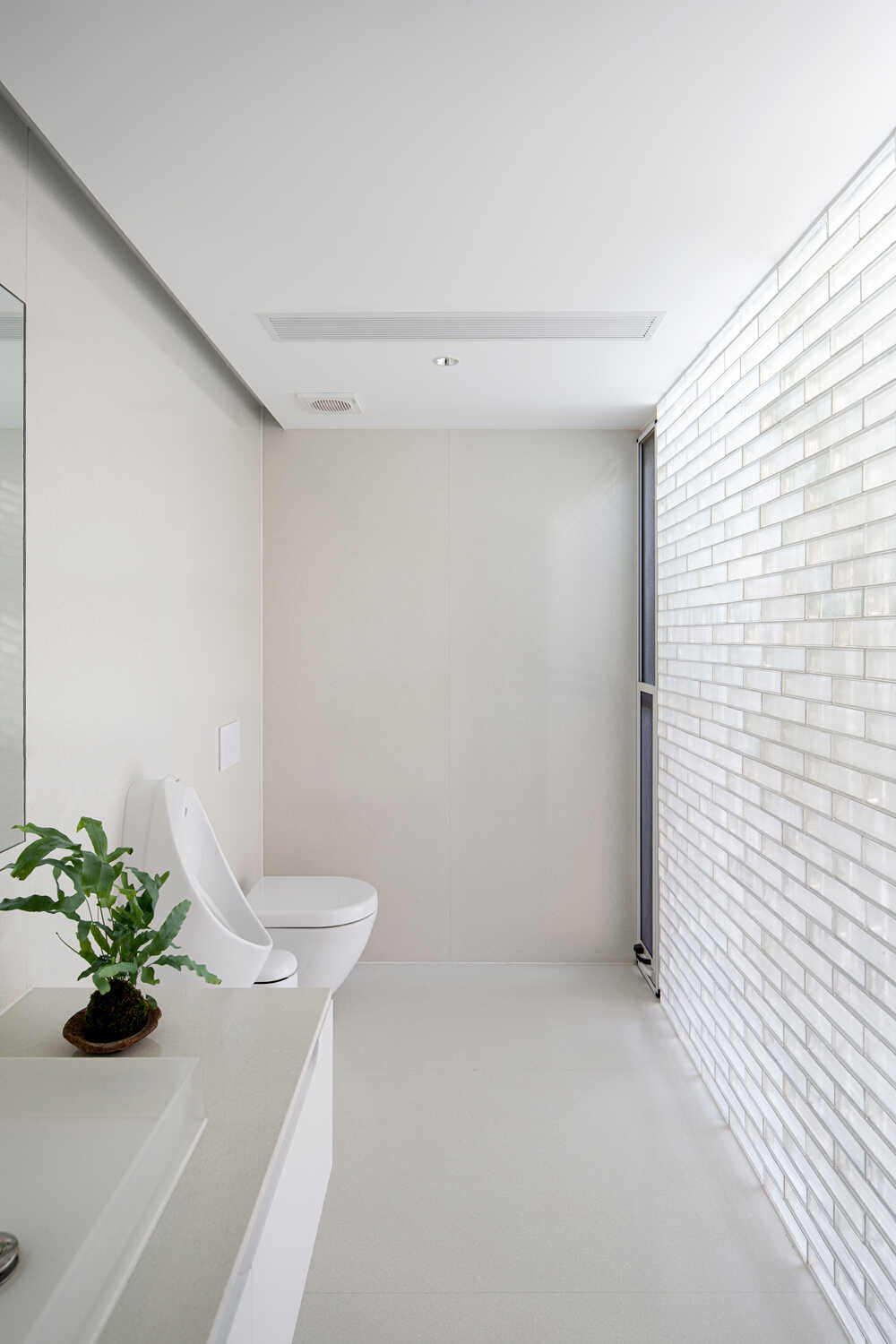
The rear section is designed as an apartment with two bedrooms, a tea room and a studio. Its lines resemble those of the inner courtyard. This portion of the veranda encompasses a trio of trees that were already growing at the site and which provide three places for rest. The bath of the two bedrooms is adjacent to a small courtyard to allow light and ventilation.
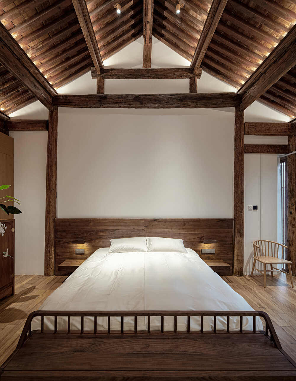
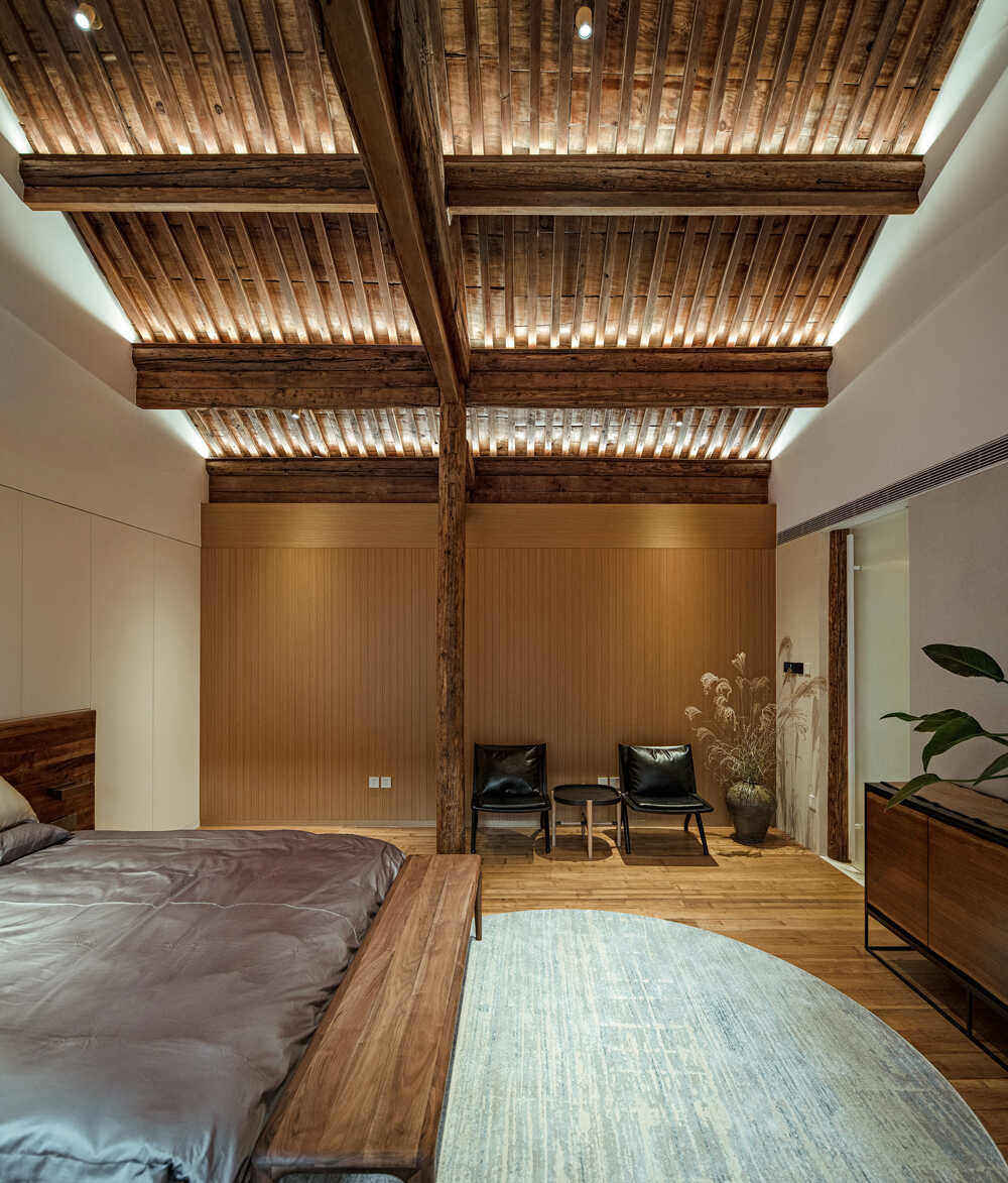
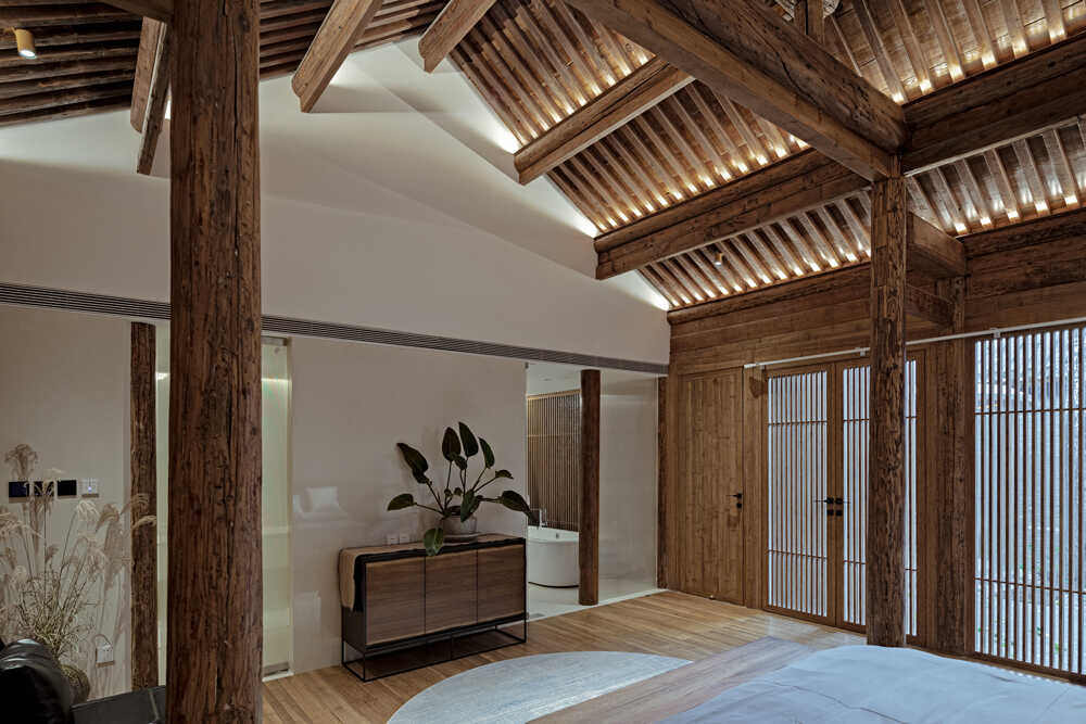
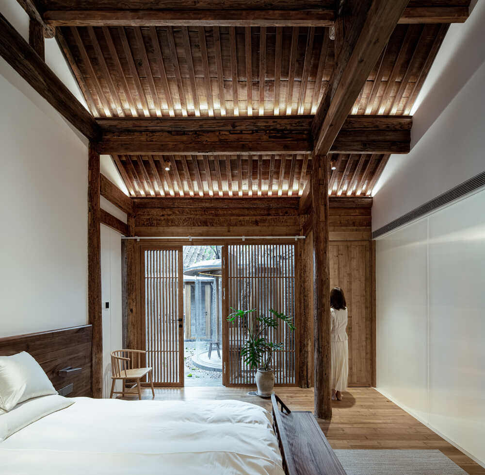
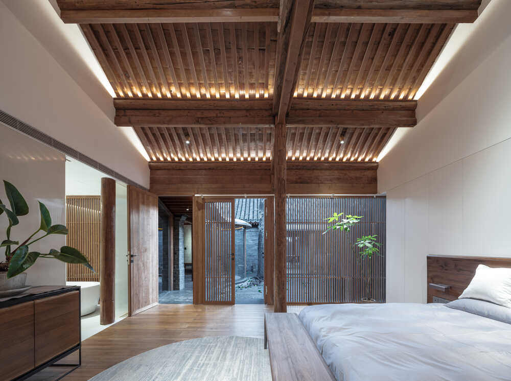
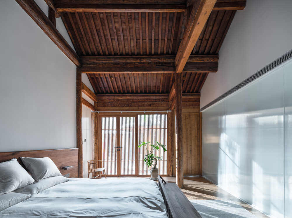
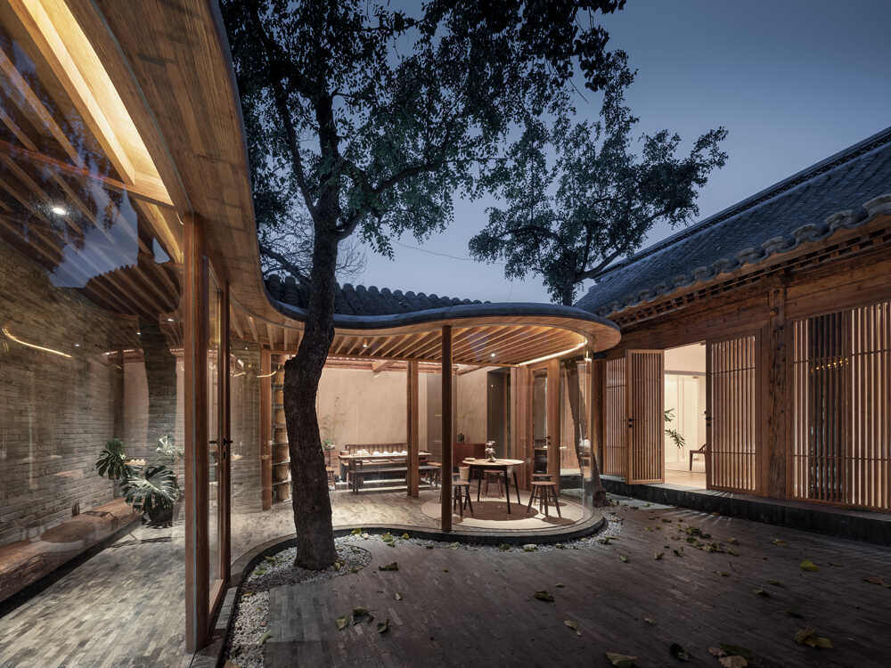
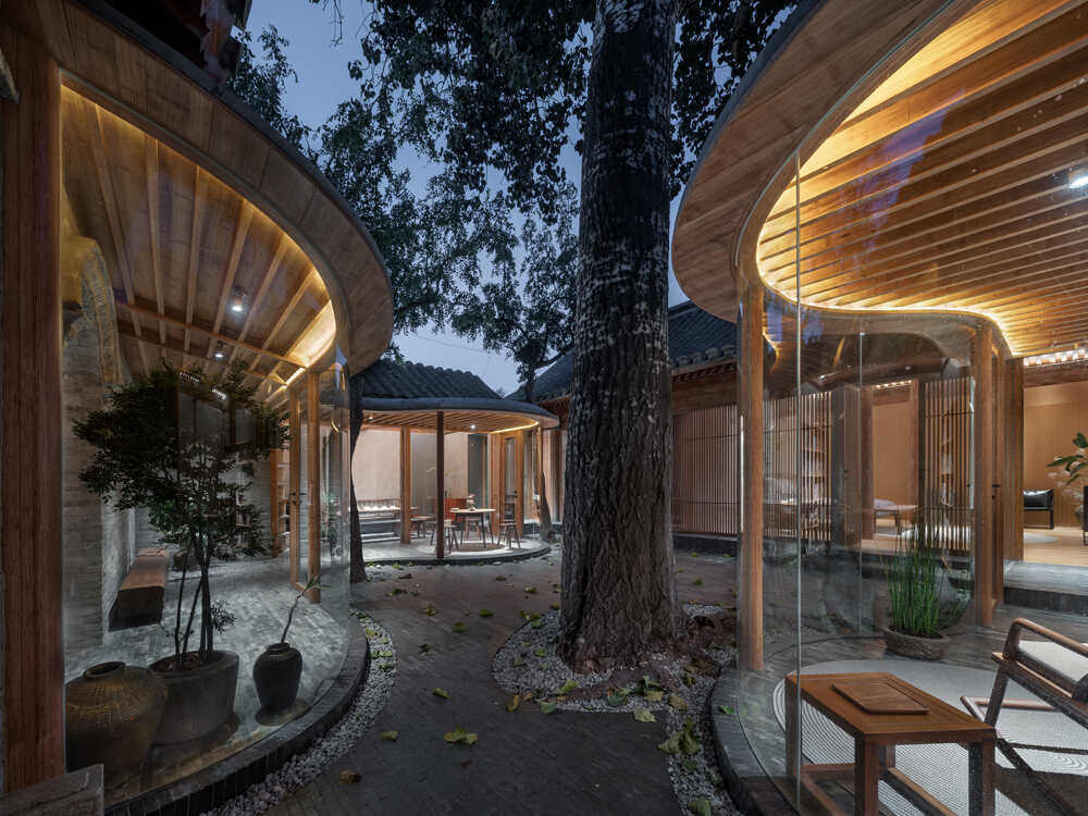
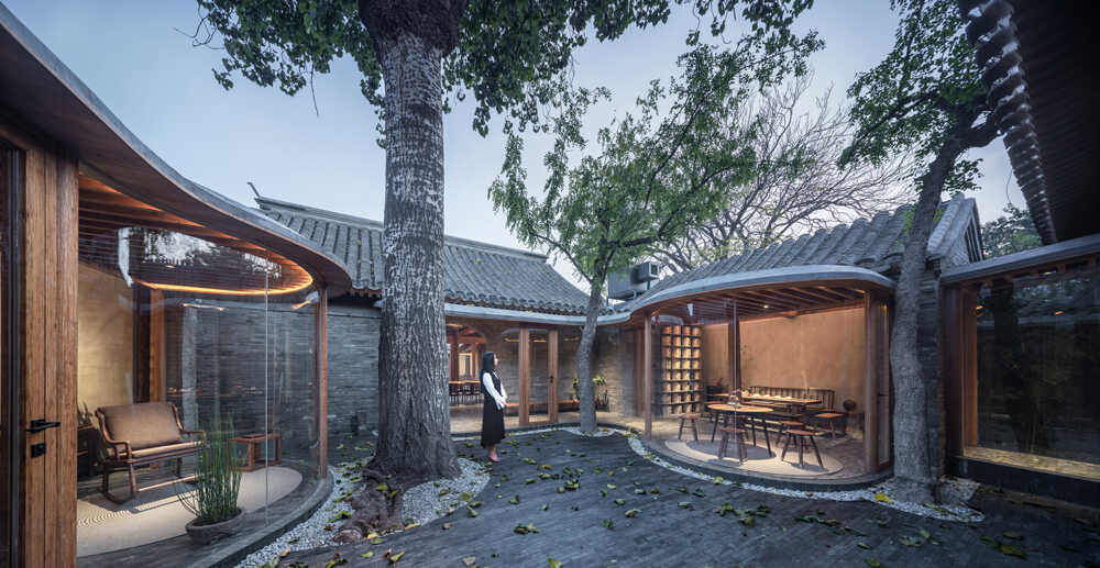
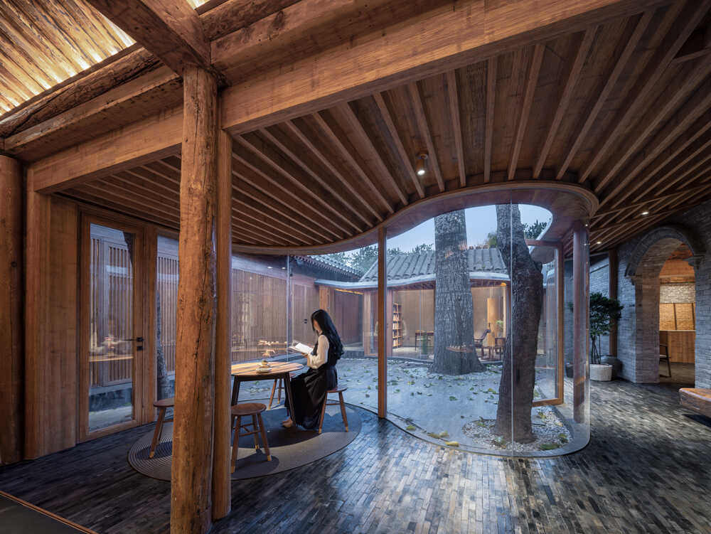
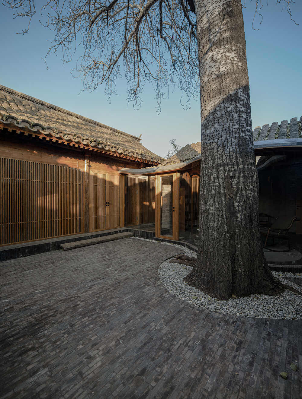
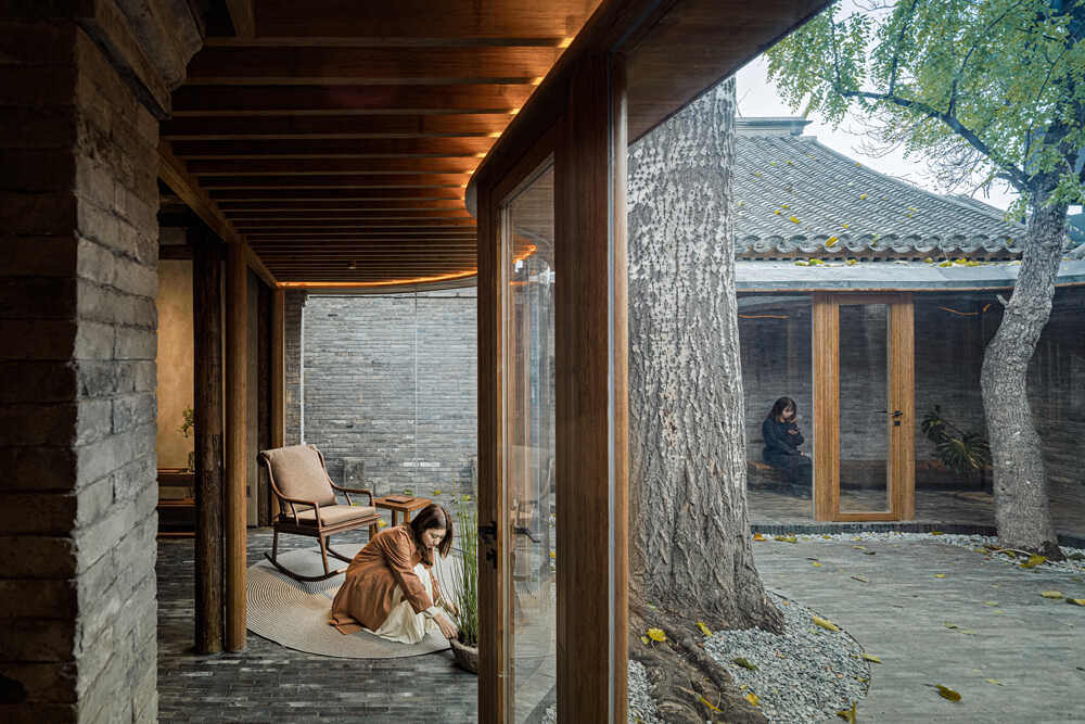
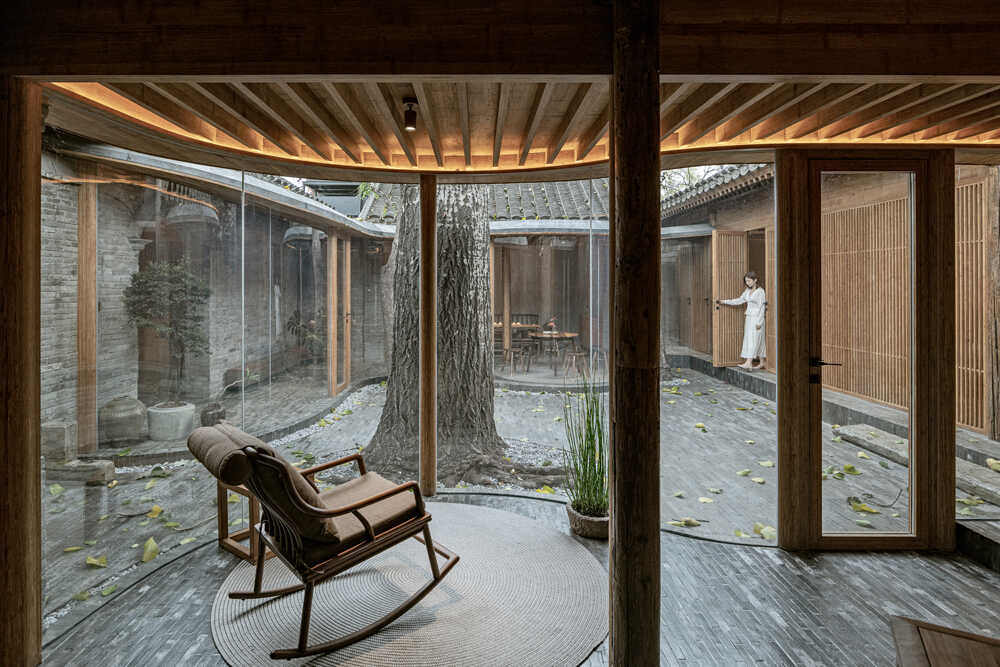
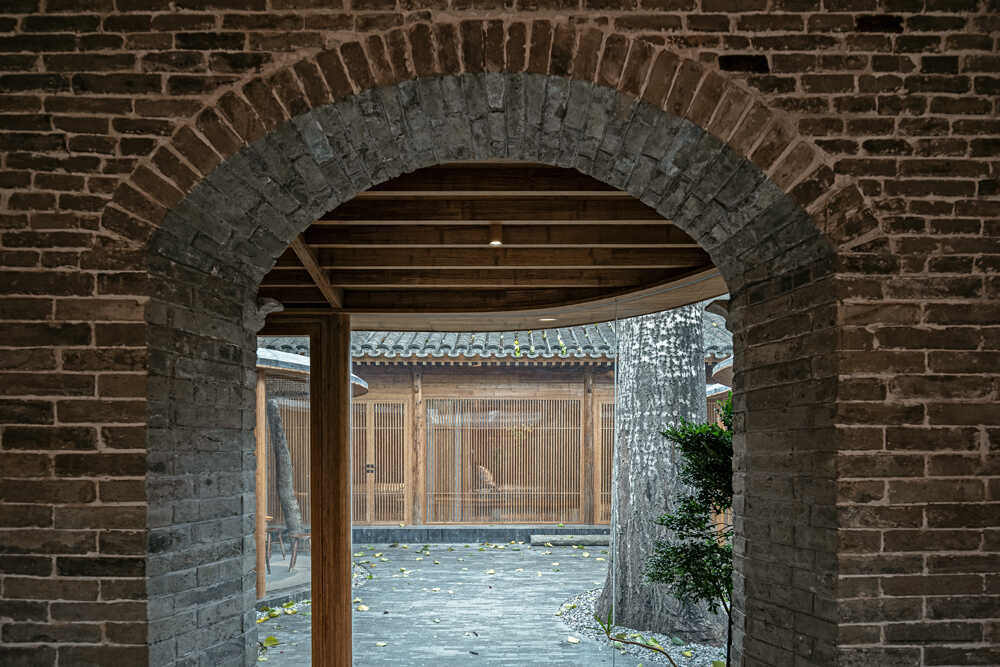
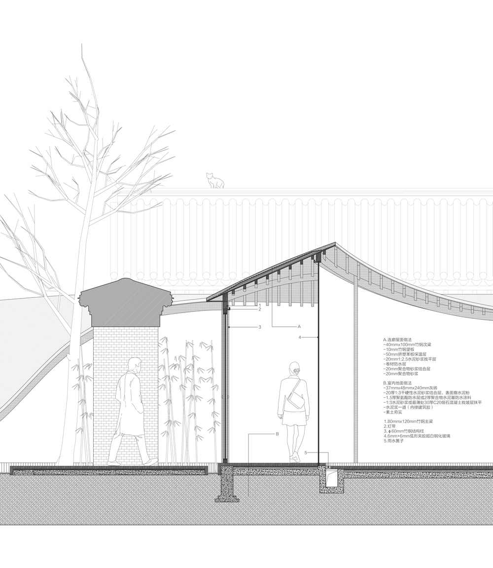
The elements of the compound’s design emphatically blend the old and the new. With impressive creativity, wisdom and delicacy, Archstudio combined past and present and created a fusion of patterns from then and now. For example, they continue to use local pine wood (which has a different appearance than the pine familiar in Israel)** that was customarily used in traditional houses. For the veranda, doors, windows, the architects introduced laminated bamboo boards (a material made of bamboo, but with a metallic sheen), which is corresponds with the older pine wood. The new veranda utilizes a frame of beams and ceiling panels, to emphasize transparency and light, and link well with the look of the old buildings.

For the basic interior design, Archstudio incorporated furniture built from old and new wood, again with the intention of echoing the older items that were carefully preserved. Wooden beams remaining after construction were used to make the chairs, thus giving new life to old materials.
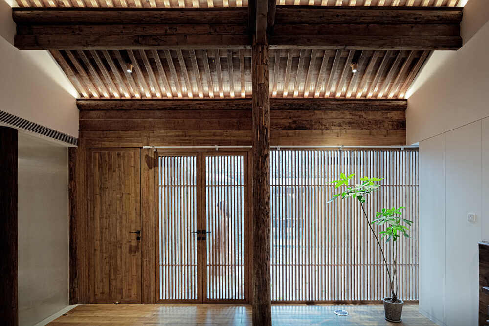
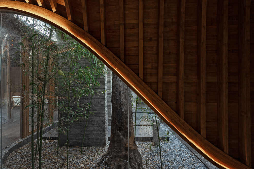
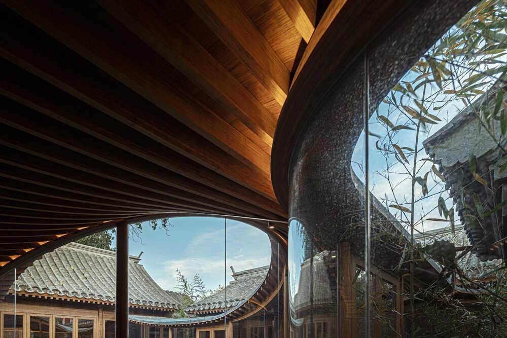
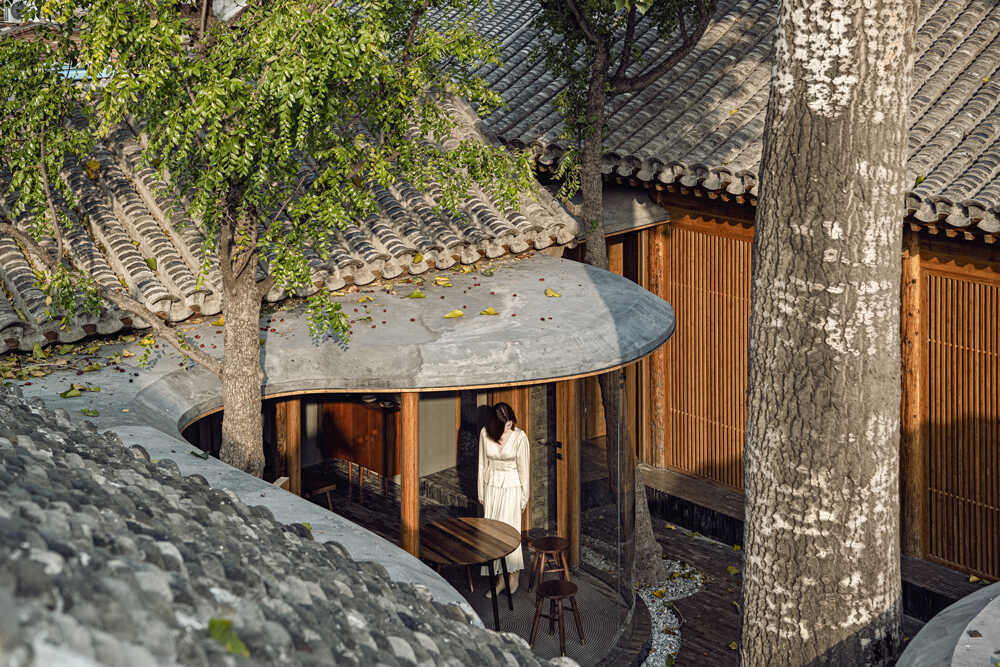
For the curved roofs that create the veranda, the designers used polymer clay, because of its smooth look. The visual contrast between the traditional gray tiles and the veranda roofs is subtle, thanks to the undulating waves and uninterrupted “flow.”
The old walls of the buildings have been restored using gray bricks found in the later buildings built in the courtyards of the houses. Preserved brick from the past were used as flooring in the courtyards, again in order to preserve the classical appearance.
קוראים יקרים, השלימו תמונת פרויקט Quishe Courtyard בצפיית וידיאו המאחד מראה העיניים – https://www.youtube.com/watch?v=NUjIo1tYwKc
Design firm: ARCHSTUDIO(www.archstudio.cn)
Chief designer: Han Wenqiang
Project designer: Wang Tonghui
Structural consulting: Zhang Yong, BAMBOO ERA
Mechanical & electrical consulting: Zheng Baowei, Yu Yan, Li Dongjie
Lighting consulting: Dong Tianhua
Plant consulting: Zhang Xiaoguang
Image editing: Wang Tonghui, Wen Chenhan
Construction team: Chen Weixing, BAMBOO ERA, etc.
Photography: Wang Ning, Wu Qingshan


