By Tami Klein
Posted in Yehudit Bar, עיצוב
Posted in design | 13 December 2022
“I am not attracted to straight angles or to the straight line, hard and inflexible, created by man. I am attracted to free-flowing, sensual curves. The curves that I find in the mountains of my country, in the sinuousness of its rivers, in the waves of the ocean, and on the body of the beloved woman. Curves make up the entire Universe, the curved Universe of Einstein.” – Oscar Niemeyer
When reorganizing a bookshelf that had fallen off the wall, I found a book on Brazilian design from 2012, which brought me back to the work of Brazilian architect Oscar Niemeyer.
The influence of Niemeyer (1907-2012) on modern Brazilian architecture was significant and his closeness with the Swiss-French architect Corbusier is very evident in his work. He designed key public buildings in Brazil, and in many cities around the world.
Niemeyer’s architectural vision, and its translation into reality, motivated the writing of this article. First, his vision of the curvy line – its origins and aesthetic contribution. Return, if you please, to the quotation at the beginning of this article – it highlights that nature and the human form are the source of his inspiration.
Second – the flow – that guides the eye and the emotions as seen, for example, in the photographs of an apartment building of his design, below. The space created under the building allows air to flow and draws the eye in. Considering also the curving line made the path of white river rocks beneath the building, we see that even the straight lines of the building are softened by their presence.
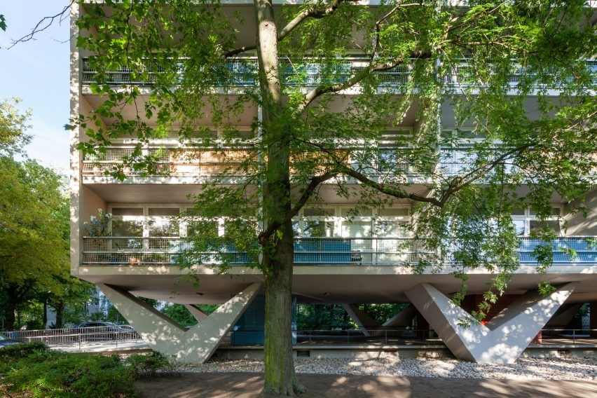
Photo by the Brazilien architect Pedro Vannucchi
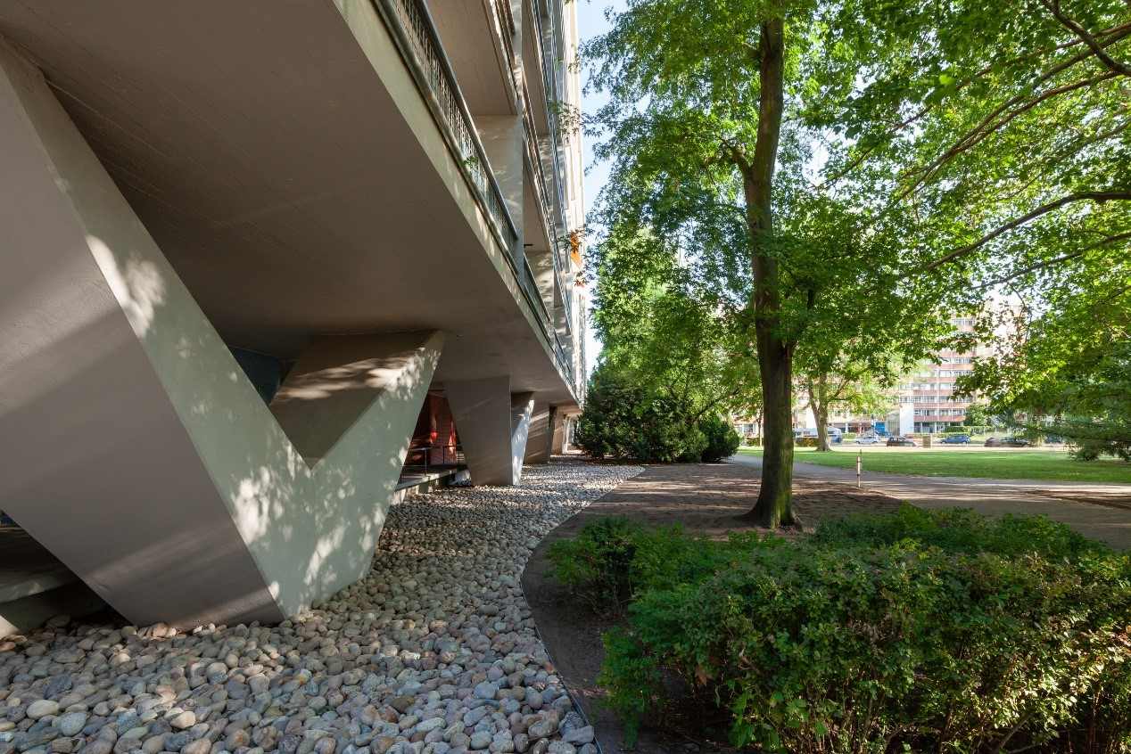
Photo by the Brazilien architect Pedro Vannucchi
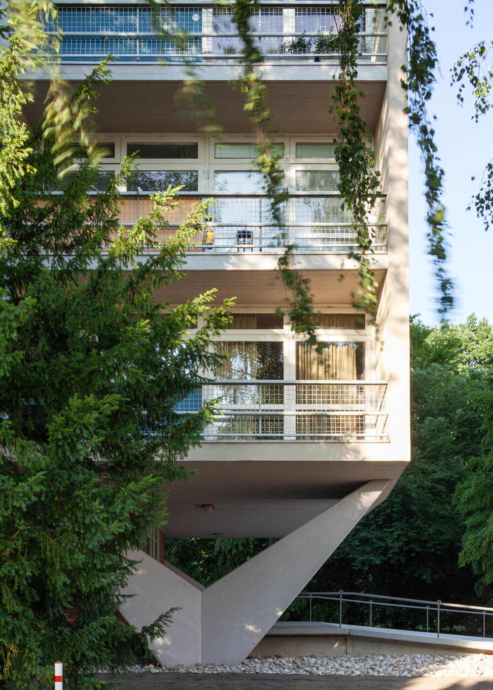
Photo by the Brazilien architect Pedro Vannucchi
These photographs of a residential building that Niemeyer designed in the late 1950s, in the green Hansaviertel district of West Berlin, are excellent examples that display his talent. In the three photos above, note how the broad, V-shaped – almost wing-like – columns, produce a refined aesthetic, beyond their practical functions of raising the building, shading the passageway and facilitating the flow of air. The uniform façade – equally-sized balconies with identical sliding glass doors – uses repetition to create visual silence.
How little the eye needs to rest and enjoy what it beholds – the shape of the building’s columns are neither too tall nor too thin, yet surprising in their shape, augmented by the repeated rectangular facades of the apartments, and the green nature in which the building is immersed. Both simple and enjoyable. And to think that this is simply a residential apartment block.
We haven’t mentioned Niemeyer’s modesty explicitly because it is self-evident in this Berlin apartment building. The beauty of modesty, in the right proportions and context, is a treasure we should all aspire to attain.
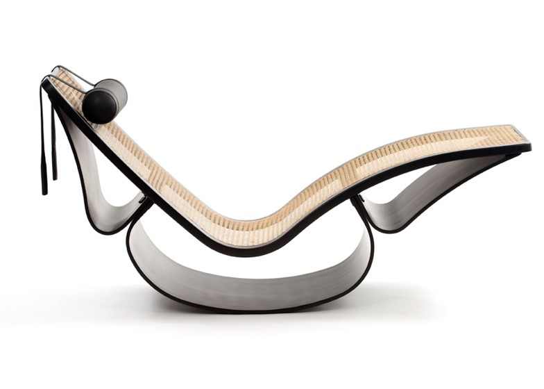
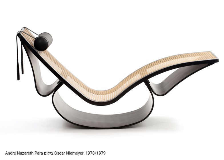
The chaise lounge, or elongated rocking chair, that Niemeyer created with his daughter Anna Maria Niemeyer, is undoubtedly a work of art – the curvaceous lines, designed in balanced proportions form a sculptural object. It is hard to move your eyes away. Blessed with talent, they were able to create a form that should be an inspiration to all; if not to create, then to fully appreciate.
As I have repeatedly noted, Israel, whose design culture is so recent, no more than a few decades old, should learn the potential of a balanced aesthetic from other cultures.


